

Secrets of a prosperous website design: a guide for beginners
If you carry on online business – or just intend to do it – you should learn how to make a successful website. It is one of the most important aspects of your progress as prosperous site can bring you a decent income. Only at first view of your site most people will judge about your professionalism, business abilities and your personality. If it does not look professional, then regardless of its content, most people will leave it, throwing only one glance, and will not even try to find out what you can offer. First impressions are half the battle, and on the Internet they play even a greater role than in real life. When a user finds a site in the search engine, your task is to arouse his interest, try to keep it and finally turn an occasional user into a regular visitor or a buyer on your site. Your website must represent you, your business or your products and attract your target visitors.
First, decide on the theme of the site. If this is a webstore, here we gathered some helpful ideas.
Once you have defined the idea, you can proceed to implementation. Here are the cornerstones of a successful website design.
-
Domain name
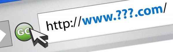
The website’s success depends heavily on the right choice of a domain name. Domain name builds a brand. You can take a free domain on a free hosting. But the paid second-level domain name looks more presentable. Effective domain name does not cost a bomb, but it is worth every penny. It must necessarily reflect the essence of your business, otherwise there will hardly be many visitors. People use Internet to find some answers to their questions. When a search engine produces a list of numerous names, users choose these ones that have the most appropriate names for the query they have entered. Do not be afraid of a long name, the main thing is to correctly characterize the site.
-
Page speed
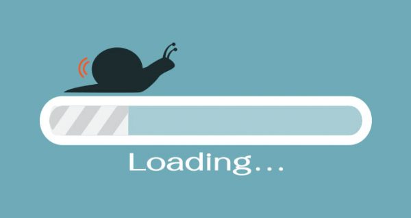
Modern users appreciate only fast internet. No one is interested in slow sites downloading for half a minute. The speed of loading pages affects the visibility of any sites including online stores. Slow performance is a killer for online stores having lots of competitors.
What speed indicators are considered to be appropriate nowadays?
- Normally page load time is not more than 2 seconds.
- If checking the download time gives values of 3 seconds and more, it is considered to be slow.
- Google recommends improving the speed if it is less than 95% of web resources.
If the speed leaves much to be desired, optimize downloaded files and improve the design. Avoid overcomplicated design – a lot of images, flash animation and so on. Do not store a huge quantity of icons on one page. 20 or 40 items can be okay, but by no means should it be several hundred at once.
-
Color scheme

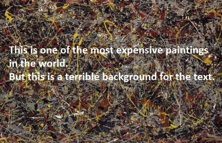
Pay attention to the acceptable contrast between text and the background.
The safest color combination for human eye is black text on a white background. Other dark-on-light schemes are also fine to use. Avoid tiring low-contrast text/background color combinations.
Busy background also makes text difficult to read and causes eye strain.
-
Font
The best fonts are Verdana or Arial. They are rounded and can be read without tension. Comparative analysis of computer fonts showed that Verdana 10-12px is the most convenient and secure for human sight. Here are the leaders of rating on readability for the web (for main text, not headers):
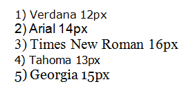
Italics are difficult to read, so try to use them as little as possible.
-
Home page of successful website

Home page should briefly cover the content of the entire site. Already here the visitor should get interested. Its design should help users to navigate the content of the pages well, but in no case should it take their mind off.
Any home page should have the following elements:
- Valuable offer. Headline is of key importance here. Express the essence of your product or service in one sentence so that users do not go to your competitors to search something better. You need to suggest them solutions of their problems.
- Usability. Avoid aggressive objects, such as flash banners, animations or other excessively complex and unnecessary elements. Respect your visitors – minimize pop-up windows and other bells and whistles. Optimize all pages for mobile devices.
- Call to action. Direct your visitors to the next step – "Free Trial Version", "Buy Now" or "More". Remember that the purpose of the main page is to keep visitors on your site and bring them to the end of the conversion funnel.
- A convenient and simple navigation system – users should easily reach any section from any point of the site.
So, to make a successful website means to create a site that makes money. Hence it should have an easy-to-remember name to grab the users’ attention. The primary goal of any ecommerce site is to stimulate a visitor to stay and look around, therefore it should be pleasant to look at and have catchy titles on the first page. It must be quick and easy-to-use to be competitive. Meeting the listed conditions, your website has a good chance to become effective and profitable.