How to make your sales go up: 9 steps to increase conversion rate
If you are engaged in any form of B2C ecommerce (take part in an affiliate program, carry on dropshipping business or maintain your very own webstore), the success of your venture is measured by the volume of generated sales. That’s exactly why the question how to increase conversion rate is a burning issue for all e-tailers.
Conversion rate formula in online retail
A conversion rate in ecommerce is an indicator showing how successful your webstore is in persuading a visitor to make a purchase. The formula of conversion rate is the following:

By conversion rate we can mean the percentage of all the website visitors who placed an order or took some other desirable action, for example:
- Filled out aresearch or contact form;
- Left you a message;
- Made you a call.
Everyone has heard general recommendations how to increase conversion rate: usability upgrading, navigation optimization, eye-catching design, high-quality content... But these all are insignificant common phrases. Below we provide real examples that can raise conversions on your website manifold.
Use marketing gimmicks to improve conversion

- New products. This section is especially relevant for regular customers. It is very useful to have a link "All new items" at the beginning and the end of the block leading to a page with new items sorted by the date of reception / addition.
- Special offers. This unit is very relevant for both old and new customers. You can always attract buyer's attention to a certain product or group of products. You can make both a banner and a block of goods. Pay attention to the new and the old price – they must be different!
- Bestsellers. This feature is especially important for large online stores. It’s very easy to get lost among the abundance of goods. Try to buy a laptop or a tablet – you will go mad from variety of goods. Lots of users hope that the experience of other buyers will help them to make choice. So don’t hesitate to display the most popular items on the main page.
Get the most out of design

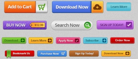
- Make CTA button more noticeable. It does not matter how tempting your proposal is if customers don’t understand how to use it. Buttons that call for action should strike the eye. The right combination of the message and the color of the CTA button will allow you to convey information to users more convincingly. If you wonder how to increase conversion rate meaningfully, statistics show that a big red button is a good choice here.
- Display product reviews in a prominent place on the site. 9 consumers out of 10 make a conclusion about the quality of the product on the basis of customer feedback. Users will be more willing to buy if you help them with making decisions and simplify site navigation.
- Add cross-selling and up-selling blocks, such as Frequently bought together / You may also like / Related products etc. It always works.
A good job on content will boost sales

- The image of the product is the key moment. It should be of high quality and give the maximum impression of the appearance of the item. Ideally there should be several photos demonstrating the products from different sides. Provide the possibility to enlarge the images. It is also desirable to show product with its relative dimensions. Show a bag on a girl’s shoulder or a mobile phone in your hand. This will avoid refunds when the customer returns a product that does not suit him by color or size.
- Use more photos of people. In a picture consisting of many different objects people subconsciously pay attention to human faces. It is always better to use photos of real people than abstract pictures that do not convey any clear meaning and are not relevant to the essence of your page.
- Videos always make websites more attractive to users. The video should be short, high-quality and effective. It should be useful and informative for users, only then it will improve conversion. It’s not so easy to make a good product video review, but it is worth trying.
We wish you high conversions!

